Every year a disparate collection of 88 wonks from 68 organisation in 12 countries work tirelessly to produce the Global Carbon Budget.
I think of it as a high powered pictured book alternative for anyone who can’t stomach the IPCC’s summary for policy makers (or just wants the data).
Here are 11 of the most thought provoking charts from this year’s report:
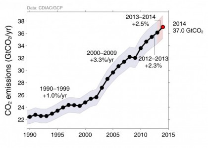
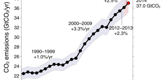
1) Carbon emissions are still going up

Another 2.3% in 2013 with projections that it will rise a further 2.5% in 2014.
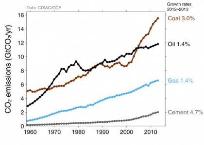
2) Coal is the major source of growth

Coal was responsible for 59% of emissions growth in 2013, oil was 18%, gas 10%, and cement 12%.
Read more: Shrink That Footprint

From Julia Latham: This resource is a data visualisation infographic filled with data on the effects food production has on our planet, but put together in a very clever way that highlights just how much is affecting sustainability.
https://www.farmmachinerylocator.co.uk/impact-of-our-consumption/