It’s almost universally agreed now that climate change is caused by humans and it’s on track to wreak havoc on the planet.
Scientists release new studies every year (if not every month) demonstrating the effects climate change has already had on the Earth and projecting the damage it will cause in the future. Storms, droughts, floods, famines, and mass extinctions are just a few of the consequences in store for our home if humans don’t do something about the problem – and fast.
We’ve put together these charts, taken from some of these studies, to help you visualize just how real the effects of climate change are. These are just a few of the reasons you should be very, very afraid.
Nothing is left unscathed.
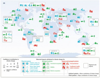
As this chart from the Intergovernmental Panel on Climate Change’s (IPCC’s) March 2014 working group report shows, climate change will hit everything from the polar ice caps to our bank accounts.
The colorful icons show what kinds of effects have been observed so far around the world, and the little bars next to the icons show how much confidence scientists have that the effects were caused by climate change. In the Arctic and other parts of North America, for example, scientists have high confidence that glaciers, snow, ice, and permafrost are melting due to global warming.
But warming doesn’t just impact weather: It changes the environments in which we grow our foods, changes the ecosystems in which the fish we eat live, increases the likelihood of wildfire, erodes the coastlines, and causes drought that robs populations of their water sources.

…
Sea levels will rise.
As sea ice continues to melt, all that excess water will cause sea levels to rise. This spells disaster for coastal areas, which will inevitably flood as the water level creeps up.
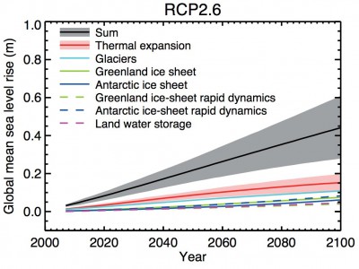
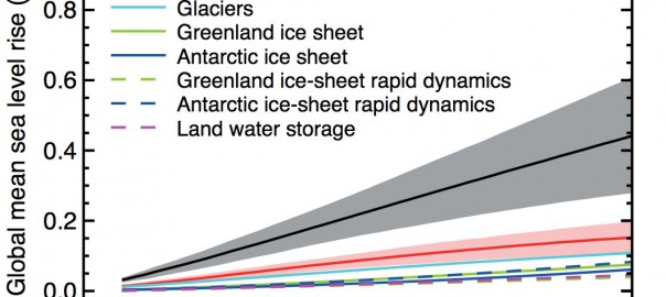
This IPCC Fifth Assessment chart shows how much sea level rise scientists expect will be caused by a variety of different factors, including the melting of large ice chunks like the Greenland and Antarctic ice sheets. The chart also factors in thermal expansion – water’s tendency to increase in volume as it gets warmer.
The gray section on the chart shows how much sea levels will rise when all of these factors are lumped together. This projection shows sea levels rising by nearly half a meter (that’s 1.5 feet) or more by 2100.

Read more: Business Insider
